Every website created on our platform is built according to responsive design principles. This means it seamlessly scales across all devices. You can control specific features - such as a custom navigation menu or footer that's unique to mobile devices - in the Mobile page in your Settings dashboard. Want to edit the design of your Mobile Navigation or Mobile Footer? You can adjust the design settings in the Design panel.
To edit your website's mobile settings:
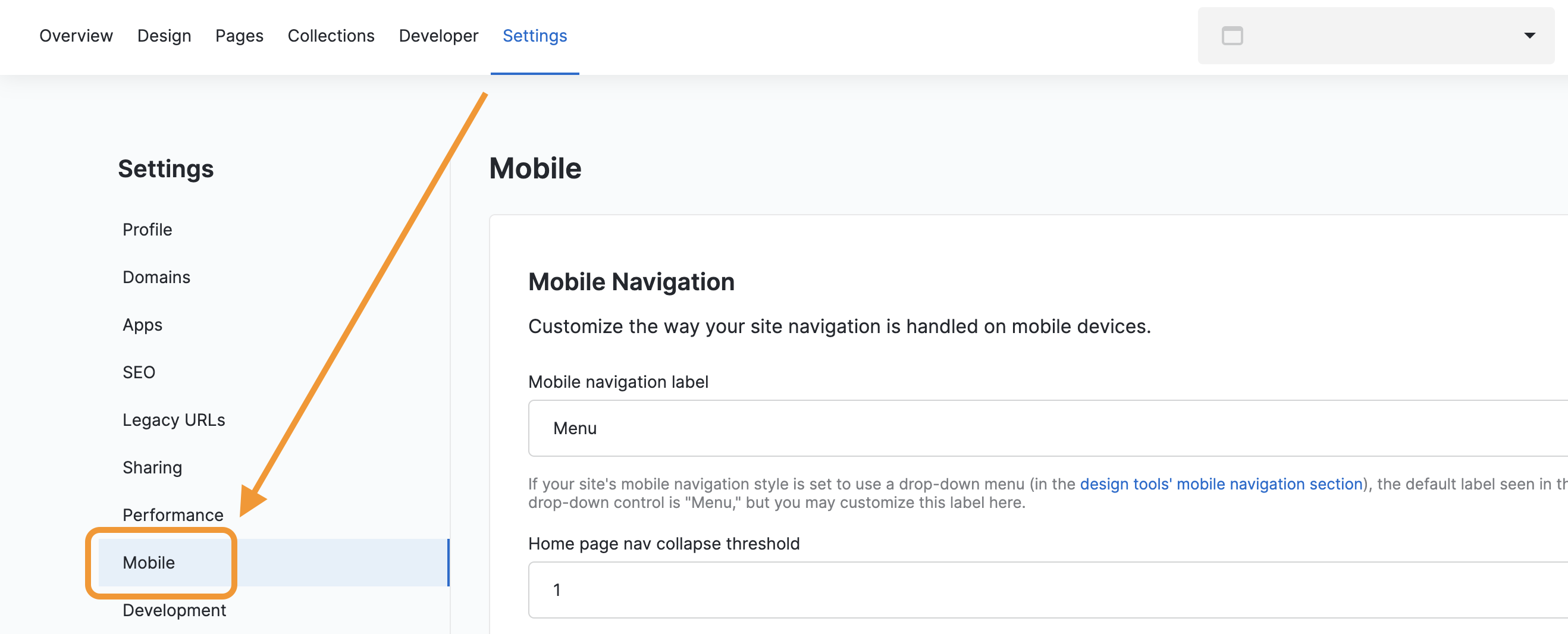
- Select the Settings tab at the top of your Websites app.
- Select Mobile on the left-hand sidebar.
Mobile Navigation
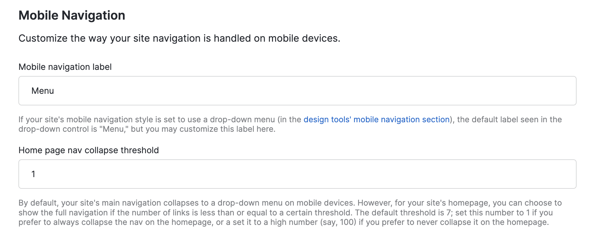
You can customize the way your site navigation is handled on mobile devices. For example, if your site's mobile navigation style is set to use a drop-down menu (in the design tools' mobile navigation section), the default label seen in the drop-down control is "Menu," but you may customize this label here.
You can also set a custom threshold for when you home page navigation collapses. By default, your site's main navigation collapses to a drop-down menu on mobile devices. However, for your site's homepage, you can choose to show the full navigation if the number of links is less than or equal to a certain threshold. The default threshold is 7; set this number to 1 if you prefer to always collapse the nav on the homepage, or a set it to a high number (say, 100) if you prefer to never collapse it on the homepage.
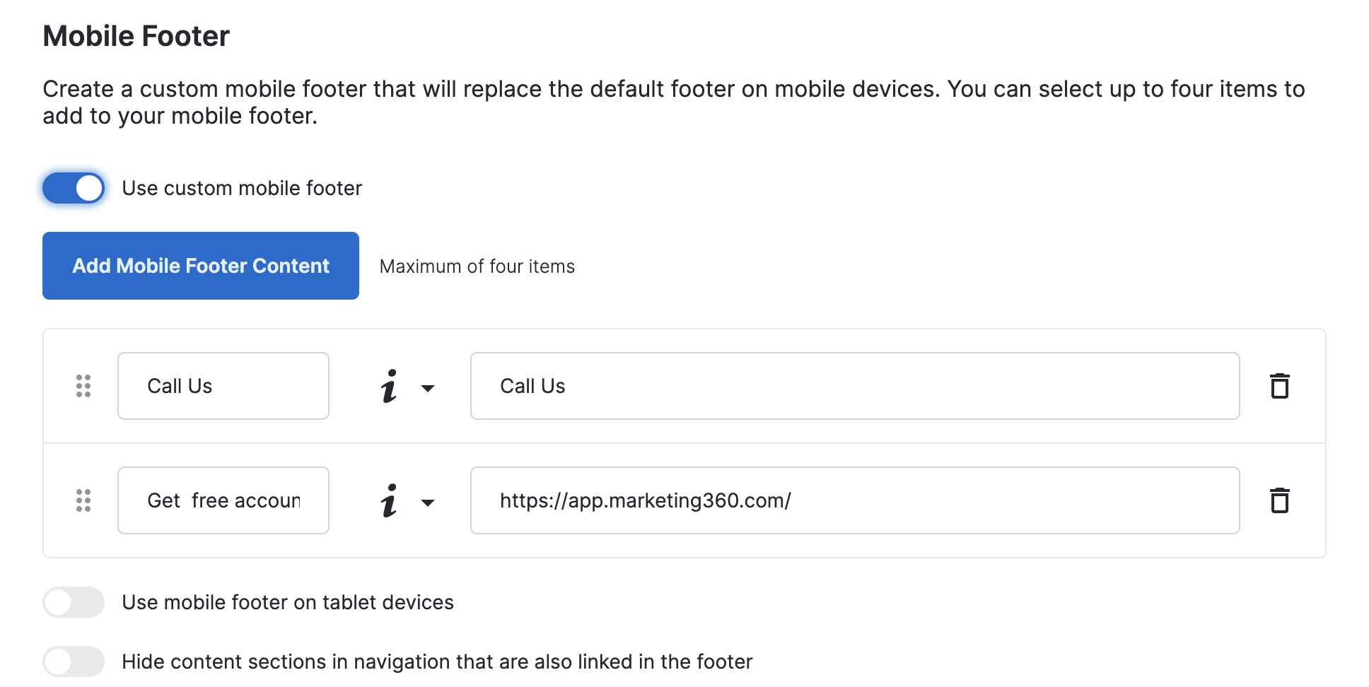
Create a custom mobile footer that will replace the default footer on mobile devices. You can select up to four items to add to your mobile footer, which will appear as "icons" on the bottom of phone screens. You can also choose to whether to display the mobile footer on tablet devices, as well as hide items from the navigation if they are already linked in the mobile footer.
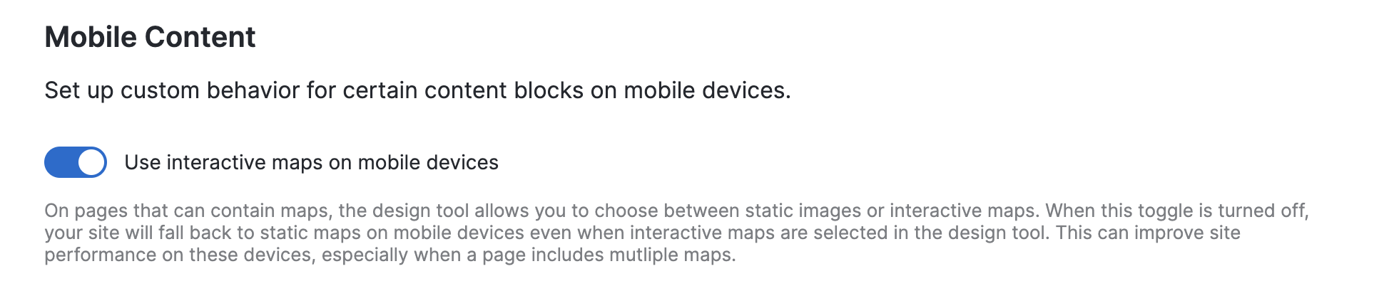
Mobile Content
Set up custom behavior for certain content blocks on mobile devices. Here, you can choose to use interactive maps on mobile devices. When this toggle is turned off, your site will fall back to static maps on mobile devices even when interactive maps are selected in the design tool. This can improve site performance on these devices, especially when a page includes multiple maps.